A Simple Shape Turned the Coca-Cola Logo Into a Timeless Icon
The Coca-Cola logo is one of the most recognizable symbols worldwide. Its enduring appeal stems from a combination of careful design evolution and a defining visual element: the dynamic “wave” or ribbon shape. This distinctive feature, integrated with the brand’s original script, transformed the Coca-Cola logo from a simple script into a timeless icon.
Early History and Development
Coca-Cola’s journey began in 1886 with a basic black wordmark, reflecting seriousness and sophistication. By 1887, founder John S. Pemberton and bookkeeper Frank M. Robinson sought a more memorable design. They chose the Spencerian script, a flowing handwriting style popular at the time, giving the brand its signature look with sweeping letters and distinctive ‘C’s.
In the late 19th century, the logo underwent several experimental changes. In 1890, it featured swirls and musical notes, but soon reverted to simplicity. By the 1890s, the script was rendered in red on a white background, a color scheme that became synonymous with the brand.
Trademark and Identity
In 1893, ‘trade mark’ was added to the swooping “C” in “Coca,” coinciding with trademark registration and reinforcing authenticity. By 1941, the script was refined for harmony and visibility, with trademark information moved below for clarity.
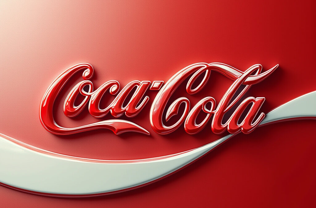
The Game-Changer: The Wave
A pivotal moment arrived in 1969 with the introduction of the white wave, or Dynamic Ribbon Device. Inspired by the Coca-Cola bottle’s shape, it evoked movement and refreshment. Replacing colored discs, the wave made the logo instantly recognizable and shifted the focus to lifestyle with the text change from “Drink” to “Enjoy.”
Later Refinements and Legacy
The wave’s role evolved, extended through the script in 1987 with a grey shadow for dimension. By 2003, it was modernized with gradients and bubbles, yet retained core elements. The interplay between the Spencerian script and the dynamic ribbon is credited with making Coca-Cola a global icon.
Key Takeaways
– The Spencerian script conveys tradition and authenticity.
– The red-and-white color scheme enhances visibility.
– The dynamic ribbon adds energy, symbolizing refreshment.
– Evolution has maintained recognition and emotional connection.
– The combination of script and shape achieves lasting brand distinction.
Emotional and Cultural Impact
The Coca-Cola logo’s enduring success lies not only in its visual appeal but also in its ability to evoke emotions and create a cultural connection. The combination of the Spencerian script and the dynamic ribbon has transcended mere branding, becoming a symbol of shared experiences and memories. The logo’s evolution has been carefully crafted to maintain this emotional bond, ensuring that each modification resonates with both old and new generations.
The Ribbon Device: A Symbol of Unity and Movement
The dynamic ribbon, officially known as the “Dynamic Ribbon Device,” plays a crucial role in the logo’s recognizability. Its flowing design not only represents movement and refreshment but also symbolizes the brand’s commitment to unity and togetherness. The ribbon has become synonymous with the Coca-Cola brand, appearing in various forms across different campaigns and merchandise, further cementing its place in popular culture.
2011: A New Chapter in Logo Evolution
In 2011, Coca-Cola celebrated its 125th anniversary, marking the occasion with a subtle yet significant update to its logo. The ribbon device was temporarily removed, and the focus was placed on the Spencerian script, emphasizing the brand’s rich heritage. This change was part of a broader strategy to reconnect with the brand’s roots while still maintaining its modern appeal. The temporary absence of the ribbon highlighted its importance and the emotional attachment consumers had developed with it over the years.
A Brand Committed to Its Heritage
Coca-Cola’s commitment to preserving its design heritage is evident in its approach to logo evolution. While many brands opt for radical overhauls, Coca-Cola has chosen a path of incremental refinement, ensuring that each change honors the brand’s history. This approach has allowed the logo to remain relevant in an ever-changing market landscape while maintaining its iconic status.
Conclusion
The Coca-Cola logo stands as a testament to the power of thoughtful design and evolutionary refinement. From its humble beginnings as a simple script to the incorporation of the iconic dynamic ribbon, the logo has transcended time and culture. Its enduring success lies in its ability to balance tradition with modernity, creating an emotional connection that resonates globally. The interplay between the Spencerian script and the ribbon device has cemented Coca-Cola’s status as one of the most recognizable and beloved brands worldwide.
Frequently Asked Questions
Why is the Coca-Cola logo so recognizable?
The Coca-Cola logo is recognizable due to its unique combination of the Spencerian script and the dynamic ribbon device, which symbolize tradition, movement, and refreshment. Its consistent red-and-white color scheme and evolutionary design have maintained its familiarity over the years.
What does the dynamic ribbon in the Coca-Cola logo represent?
The dynamic ribbon, or Dynamic Ribbon Device, represents movement, refreshment, and unity. It was inspired by the shape of the Coca-Cola bottle and has become a symbol of the brand’s commitment to togetherness and shared experiences.
What is the origin of the Spencerian script in the Coca-Cola logo?
The Spencerian script was chosen in 1887 by Coca-Cola’s founder, John S. Pemberton, and bookkeeper Frank M. Robinson. It was a popular handwriting style at the time, known for its flowing and elegant appearance, which gave the brand its distinctive look.
What was the most significant change to the Coca-Cola logo?
The most significant change was the introduction of the white wave, or Dynamic Ribbon Device, in 1969. This addition transformed the logo into the iconic symbol we know today, shifting its focus from functionality to lifestyle and emotional connection.
Why has the Coca-Cola logo remained timeless?
The logo’s timelessness stems from its careful evolution, maintaining core elements like the Spencerian script and the dynamic ribbon while adapting to modern design trends. This balance between heritage and innovation has kept the logo relevant and emotionally resonant.
Was the dynamic ribbon ever removed from the Coca-Cola logo?
Yes, in 2011, during Coca-Cola’s 125th-anniversary celebration, the dynamic ribbon was temporarily removed to emphasize the Spencerian script and reconnect with the brand’s heritage. The ribbon returned, highlighting its importance to the brand’s identity.